
End of the video above
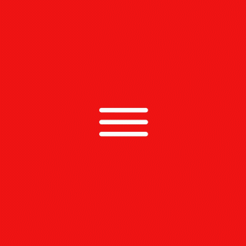
The pulse: born of digital interaction.
A red line on a white surface is often all it takes to ensure recognition of Deutsche Bahn as the originator. We combine this image with the opportunities provided by digital surfaces to create a new element: the pulse expresses our personality and brings users and the brand together across all touchpoints.


Areas of application
Next to our logo, the pulse is the most important brand element of Deutsche Bahn. Its areas of application are versatile and range from digital media to product design. As a layout element, the pulse structures our content, as an illustrative icon, it makes information quickly understandable and as a digital character, it interacts with our customers.
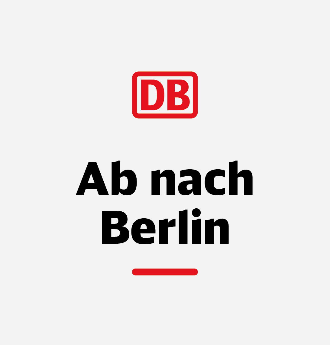
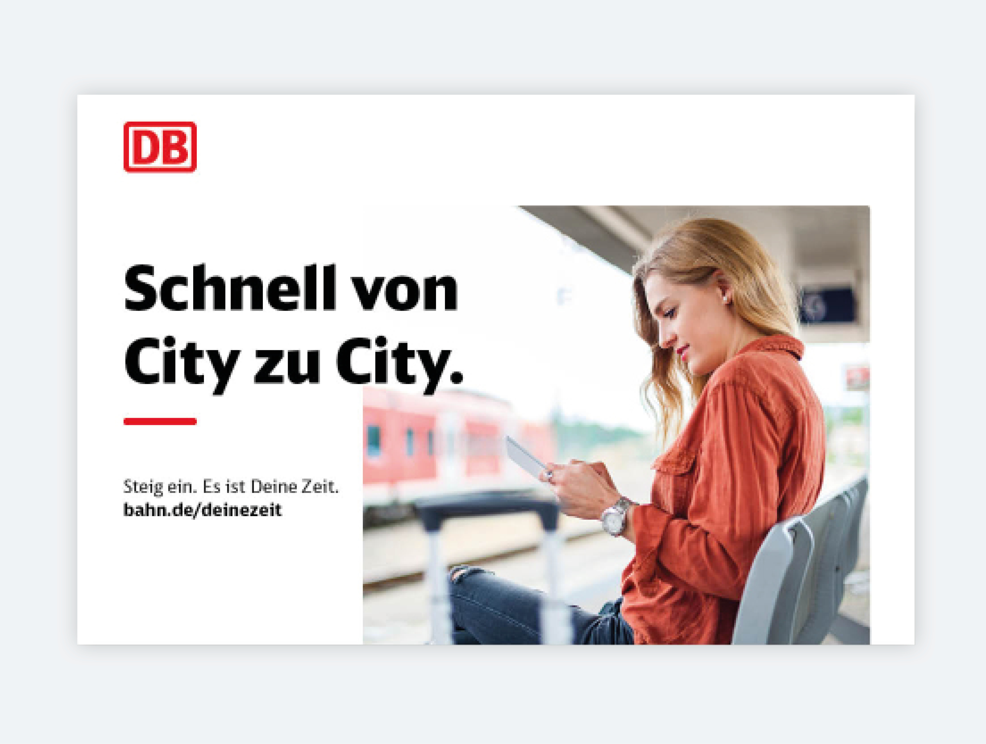
1. Layout element
2. Illustrative icon

3. Digital character
1. The pulse as a layout element
As a layout element, the pulse structures our content. Together with the logo, it serves as a visual frame for messages and other content and can be used for digital and analogue communication media. It ensures order, clarity and comprehensibility. You can find more detailed information on its use in the layout section.

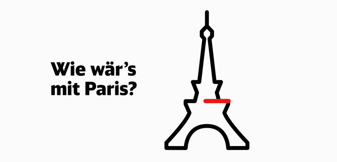
2. The pulse as an illustrative icon
As an illustrative icon, the pulse conveys complex information and tells emotional stories about our brand. For example, it can positively support feedback situations in the user interface or serve as an image substitute for photographs. In this way, the pulse provides clarity and increases the likeability of Deutsche Bahn. You can find more details in the icons section.
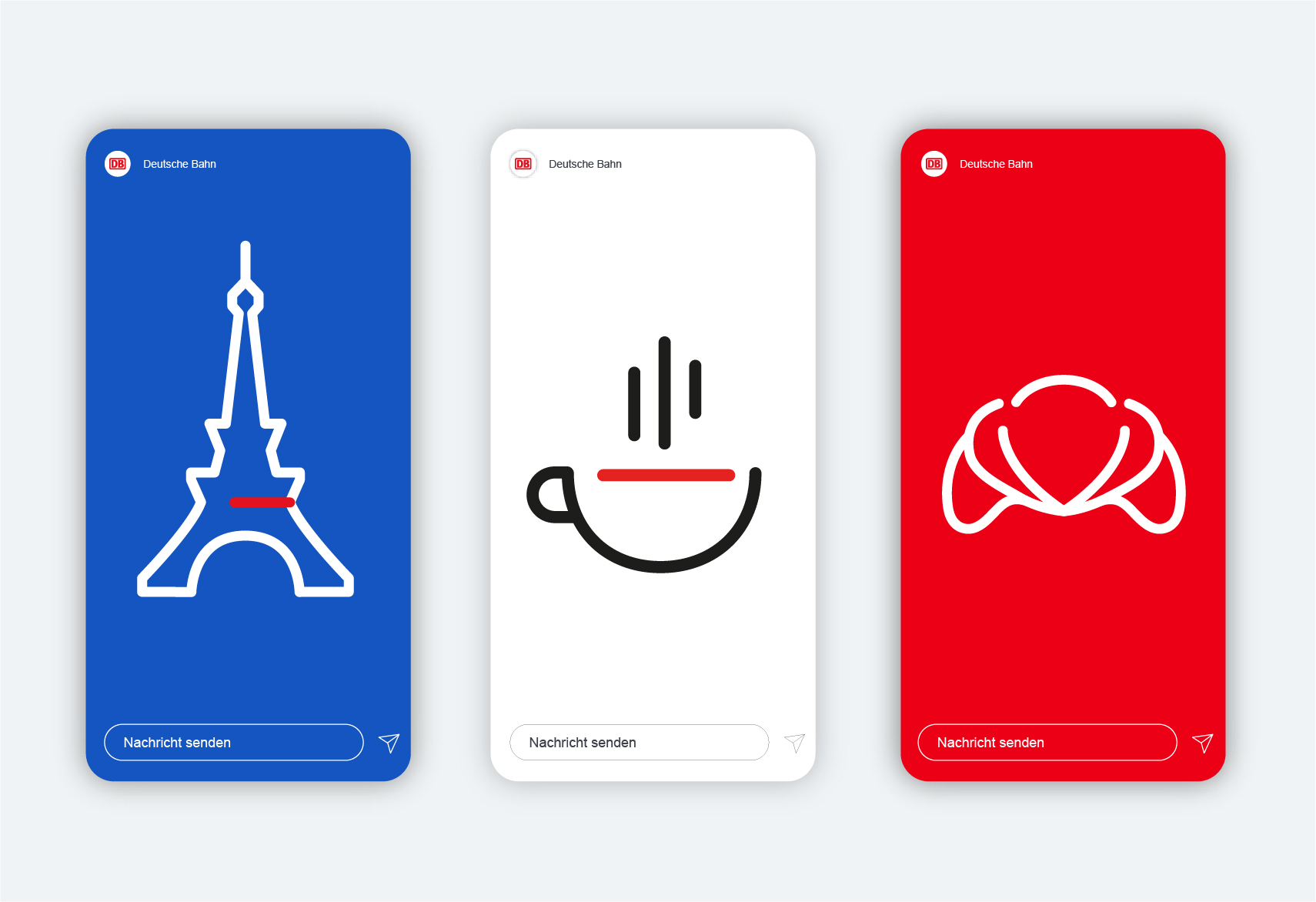
3. The pulse as a digital character
As a digital character, the pulse represents emotions and simple information in an abstract way. It is used in direct interaction with the user, e.g. as a chat bot or VUI (voice user interface). In this way, it becomes a ‘virtual travel companion’, creating understanding and a bond between user and brand.


Colour variants
There needs to be sufficient contrast between the pulse and background. Use the red pulse if at all possible, though there is also a white alternative. When using the white pulse, please ensure that the layout features other red elements such as a violator. The pulse and logo do not necessarily have to be the same colour.
Red pulse on a light background.

White pulse on a dark background.
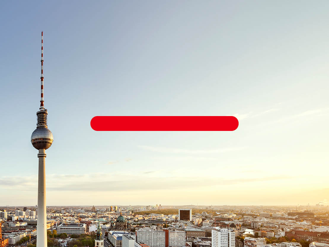
Red pulse on a light image.

White pulse on a dark image.
Dimensions and ratios
There are two fixed sizes for the pulse as a layout element and digital character. To simplify use to the highest degree possible, we have provided the pulse in the appropriate size ratio to the logo. Both pulse variants are available for download. As part of an illustrative icon, the pulse can vary in size and is oriented to the line width of the entire icon construction in this case.

Frequency and combination
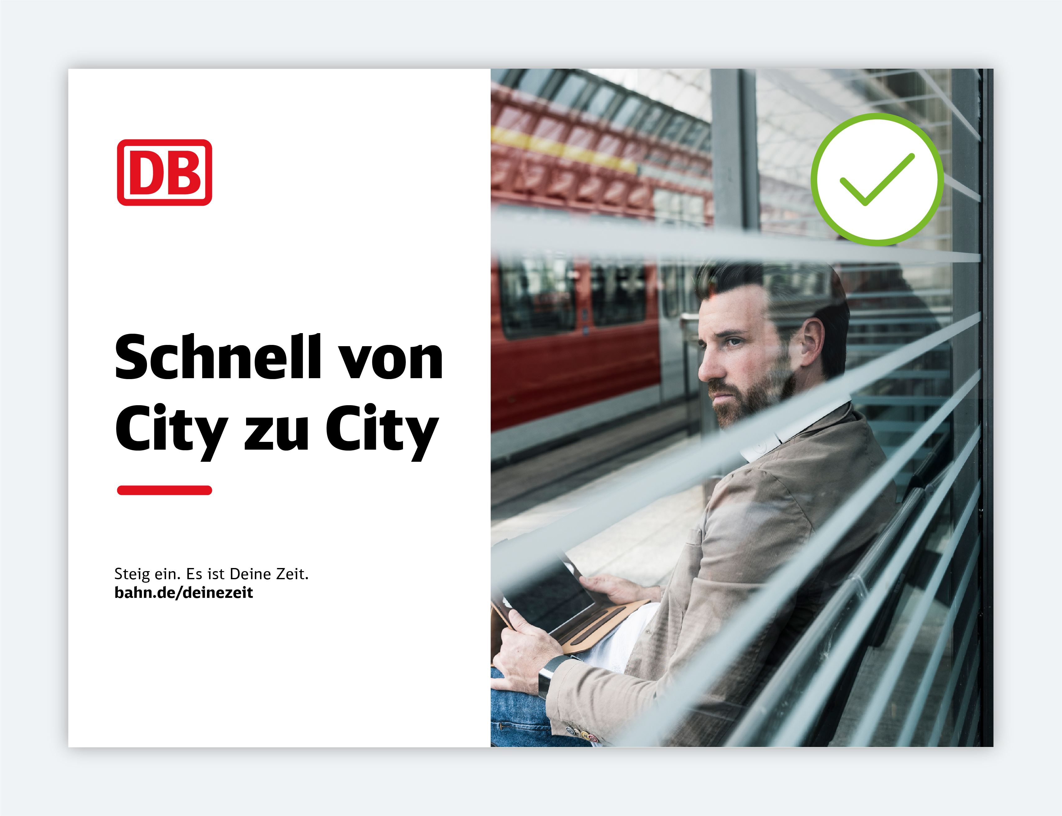
The pulse should not be used excessively. It always takes on a prominent role and marks the most important content, such as the headline. The pulse should therefore only be used once per medium (for classic communication media) or only once per visible screen (for digital media). However, the combination of the pulse as a layout element and an illustrative icon is possible.

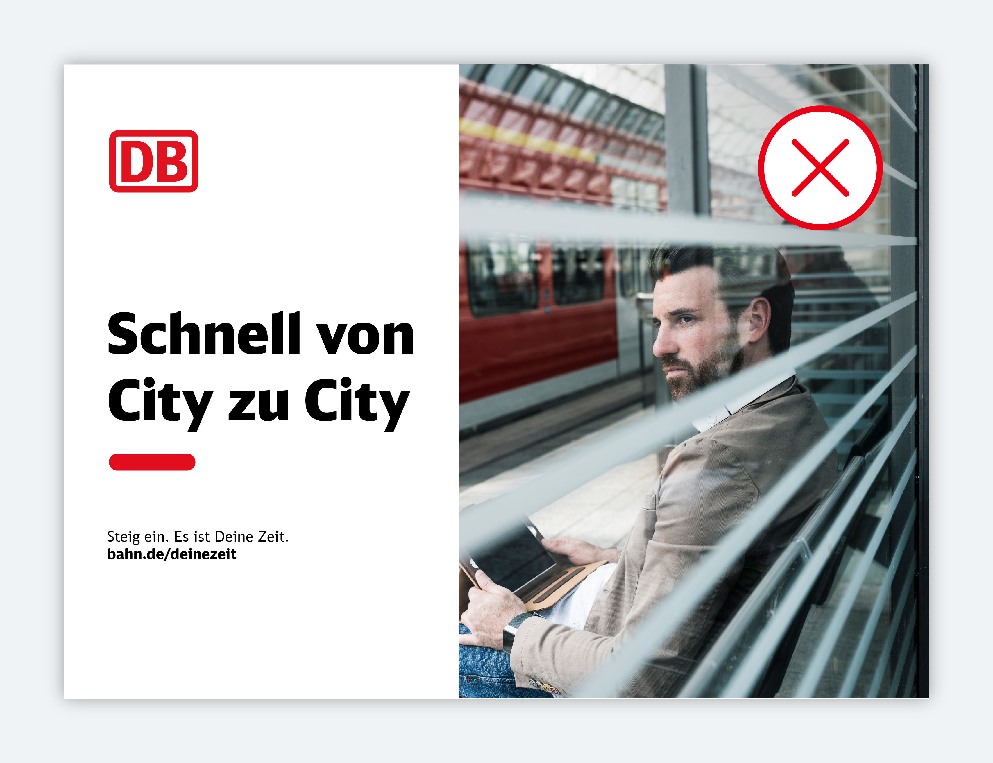
Prohibited: Excessive use of the pulse.
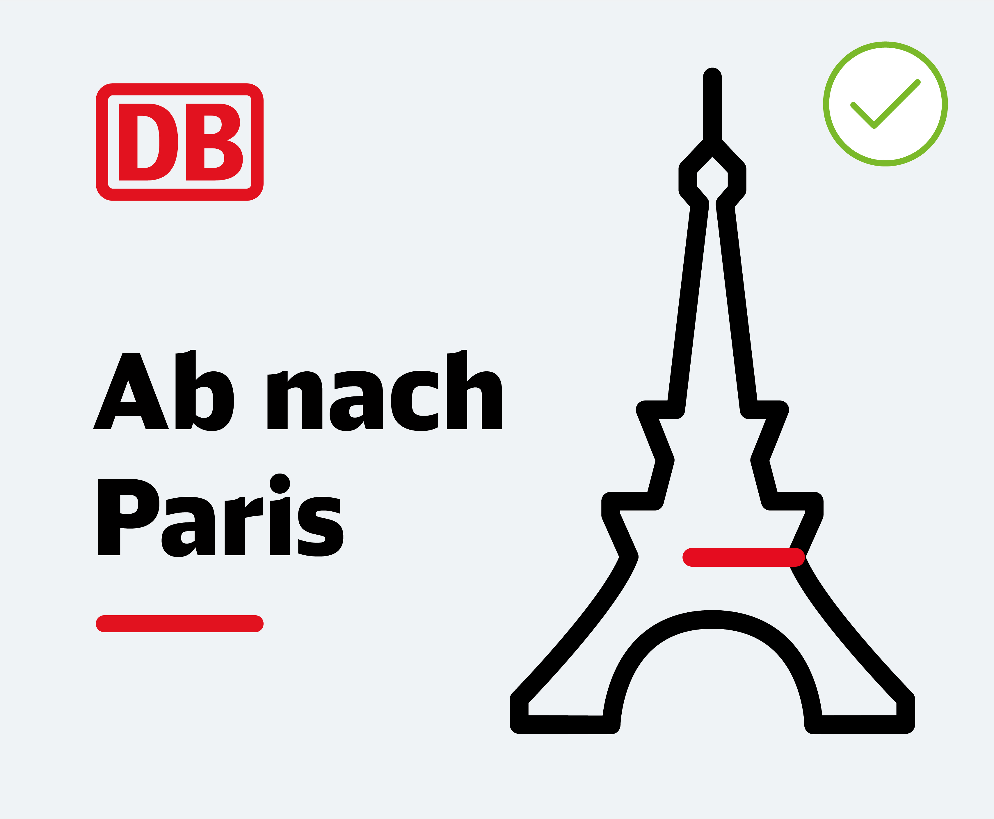
Allowed: Combination of the pulse as a layout element and as an illustrative icon.
Any questions?
Our corporate design gives you a great deal of freedom: we have consciously refrained from precisely defining every special case. Instead, you can decide for yourself which solution is the best for Deutsche Bahn. If you have any questions about how to interpret the corporate design, it goes without saying that we will be pleased to provide further assistance.
 Go
Go