End of the video above
Animation: movement brings mobility to life.
Movement brings Deutsche Bahn’s personality to life. On a communication level, brand-typical animations support the storytelling, whilst ensuring usability in the UI and imbuing interactions with character.
Application principles
Animation curves – emotionally charged and functional
Two animation curves help us to illustrate movement in a variety of ways, from expressive to functional. Based on the brand personality, our characteristic animation curve is complemented by a second, functional animation curve, which enables prompt feedback in certain interactions with users. It’s factual and reserved.
Our movement starts with a natural acceleration. The basic tempo is dynamic and target-oriented. Controlled braking completes the animation with confidence.

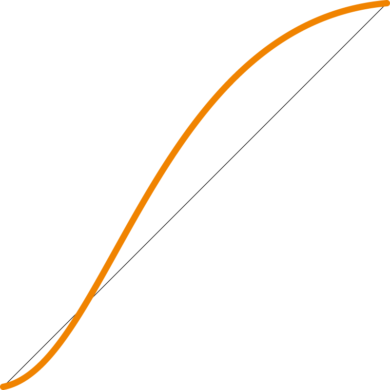
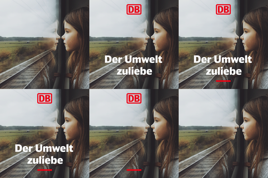
Emotionally chargedThe emotionally charged animation curve imbues animated elements with dynamism and character. It makes them stand out and forms the basis for animating icons, banners, etc.
Web applications – CSS:Transition-timing-function: Cubic-bezier (0.27, 0.05, 0.4, 0.95)
Adobe After Effects:Initial speed: 33%Final speed: 70%

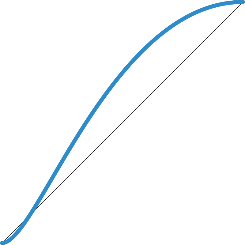
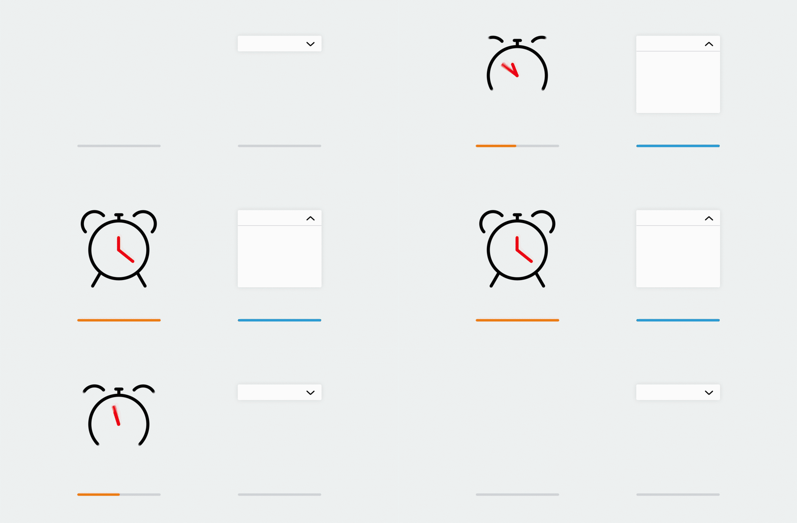
FunctionalThe functional animation curve is used for fast and subtle animations, wherever users require prompt feedback (e.g. drop-down menu) in an interaction.
Web applications – CSS:Transition-timing-function: Cubic-bezier (0.15, 0, 0.45, 1)
Adobe After Effects:Initial speed: 15%Final speed: 55%
Duration/time
The duration of an animation is based individually on the content to be animated. Functional elements are thus usually allocated a short animation duration to prevent delaying an interaction. Content, on the other hand, is granted the animation duration necessary to ensure an attention-grabbing appearance. As a rule of thumb, animations support content in its appearance, though the animation never takes centre stage. Long animation times should thus be avoided.
Direction
We animate elements horizontally or vertically, but never diagonally. The preferred animation direction in our communication is horizontal, from left to right.
Order
We structure our communication in the following animation order:
- Image/background
- Signatory/logo
- Message
- Pulse
- Graphic elements
- Interactive elements
Any questions?
Our corporate design gives you a great deal of freedom: we have consciously refrained from precisely defining every special case. Instead, you can decide for yourself which solution is the best for Deutsche Bahn. If you have any questions about how to interpret the corporate design, it goes without saying that we will be pleased to provide further assistance.


