
End of the video above
Our icons: universal and easy to understand.
Icons illustrate important information in a compact space. Particularly in digital user interfaces or in buildings and vehicles, they provide guidance and, along with the logo and typography, represent important ambassadors of our brand: the style of our icons is based on well-known elements and thus ensures clear recognition.


A summary of key points:
- The pulse is a key component of our icons.
- We divide our icons into three categories: functional UX icons, functional object icons and illustrative icons.
- Use functional UX icons primarily as navigation elements in the user interface and functional object icons in vehicles and buildings.
- Use illustrative icons to communicate stories and ideas.
Our universal symbol system
Our icons are based on Deutsche Bahn’s design style and are ideally constructed out of lines. We differentiate between functional UX icons and functional object icons as well as illustrative icons.
Functional UX icons
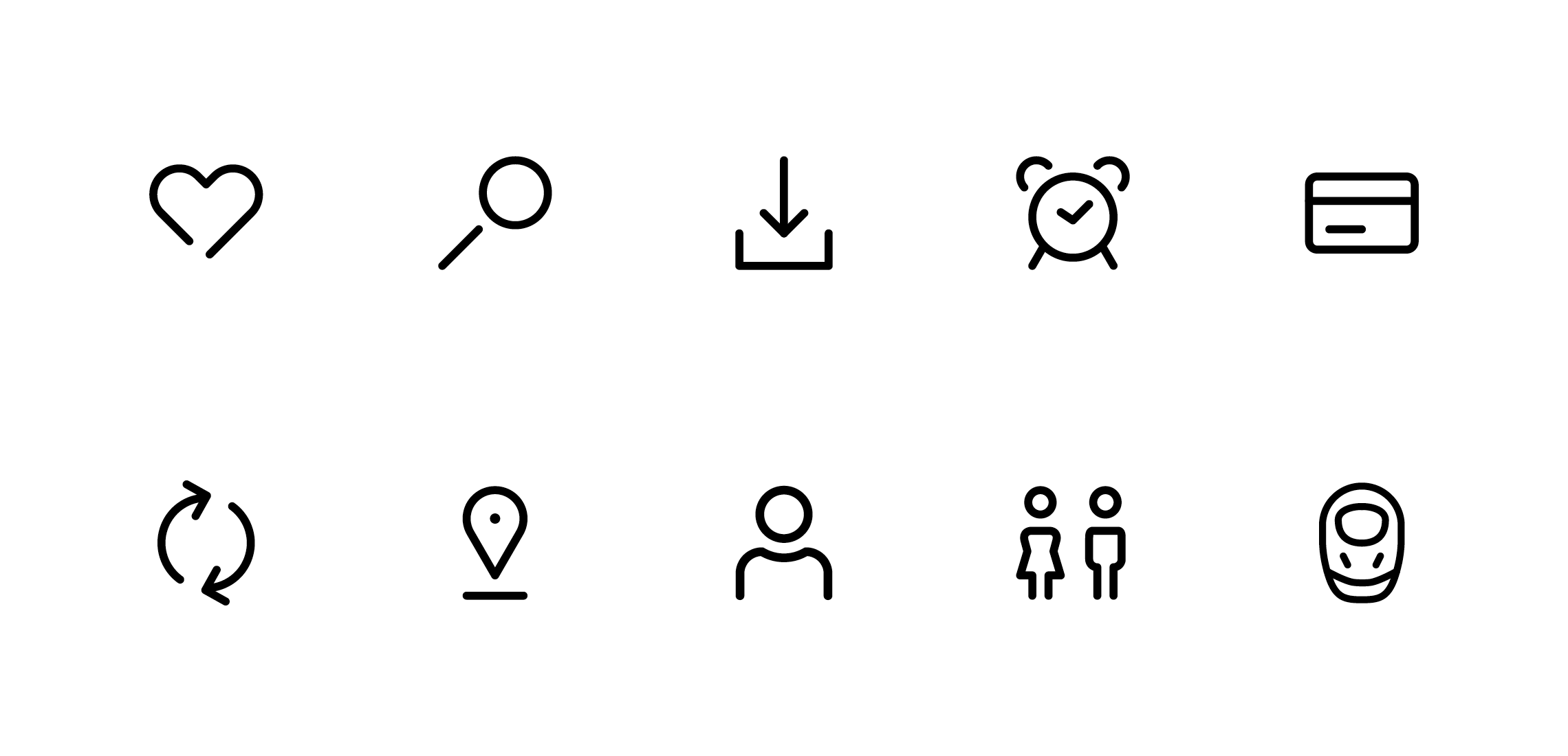
Functional UX icons represent commands and interactions. Because they’re universally understandable at first glance, they illustrate user interface options and act as a guide. Their design is inspired by the design style of the pulse.
You can find detailed instructions on how to create and use the functional object icons in the UX-Guide.
Functional object icons
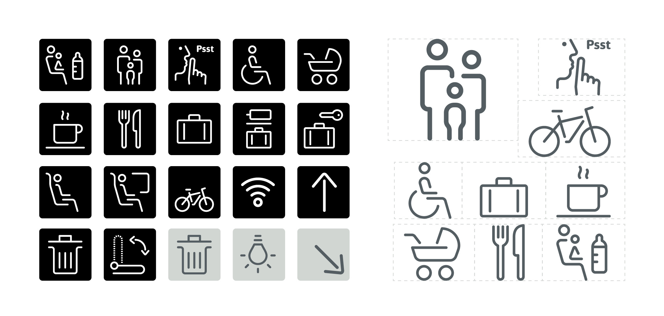
Functional object icons are primarily used in the context of vehicles and architecture. In terms of design, the icons are based on the character typical of the brand: clear, geometrically linear design, appealing, timeless.
You can find detailed instructions on how to create and use the functional object icons under Applications.
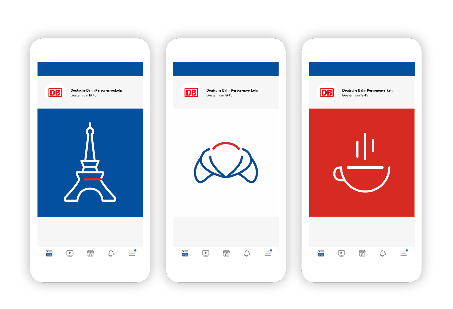
Illustrative icons
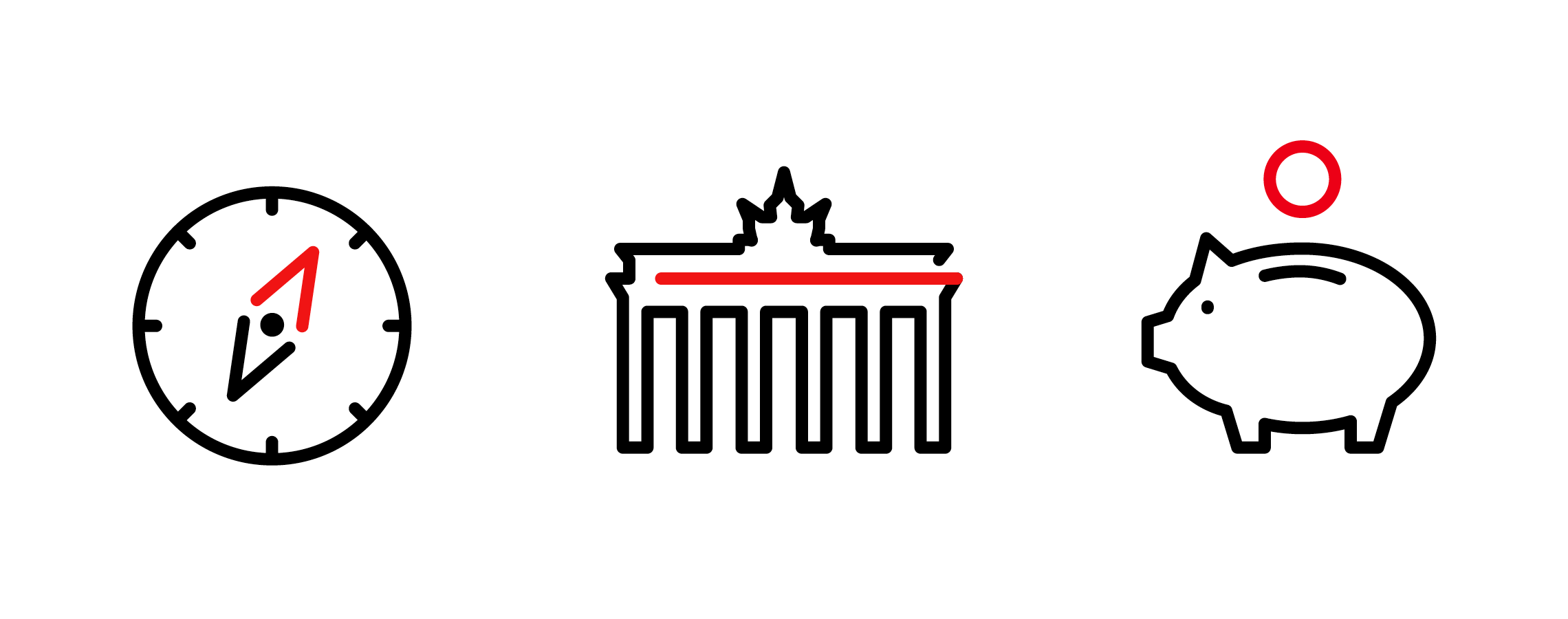
Illustrative icons are more complex in their design than functional icons. They serve to visualise stories and ideas associated with the Deutsche Bahn brand. The pulse is a key component here, too, and stands out due to its two-tone design.
The instructions for both functional UX icons and illustrative icons can be found in the UX-Guide.
Animation

Example animation for attracting attention.

Example animation of an icon forming and diminishing.

Example animation for switching from one icon to another.

Example animation for an illustrative icon.
Download
Registered users can download the basic packages here.
Any questions?
Our corporate design gives you a great deal of freedom: we have consciously refrained from precisely defining every special case. Instead, you can decide for yourself which solution is the best for Deutsche Bahn. If you have any questions about how to interpret the corporate design, it goes without saying that we will be pleased to provide further assistance.
 Go
Go