
End of the video above
Our logo: confident and powerful.
We’re represented throughout the whole of Germany, which is why just about everyone knows our logo. This high level of awareness enables flexibility in its use, so that limited guidelines are sufficient. Feel free to use our logo freely and with confidence.

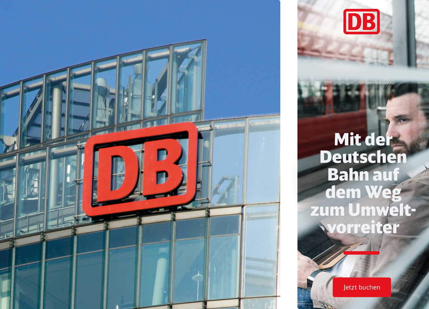

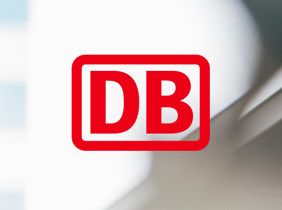
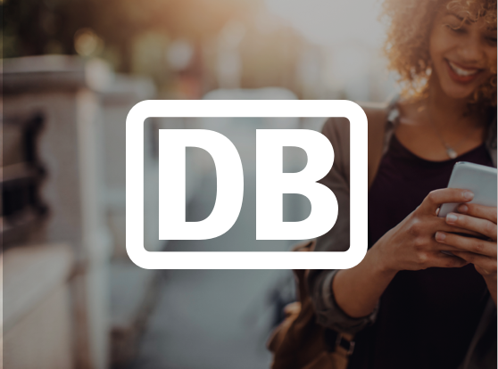

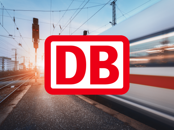

The logo must have a sufficient contrast to the background. Use it on busy backgrounds with a white inner surface or use the white variant if the logo is on dark images or a red background. There are exceptions where the logo may also be used as a watermark or image mask. Discuss any further details with our brand management team: marke@deutschebahn.com
Positioning options
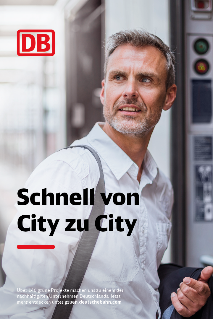
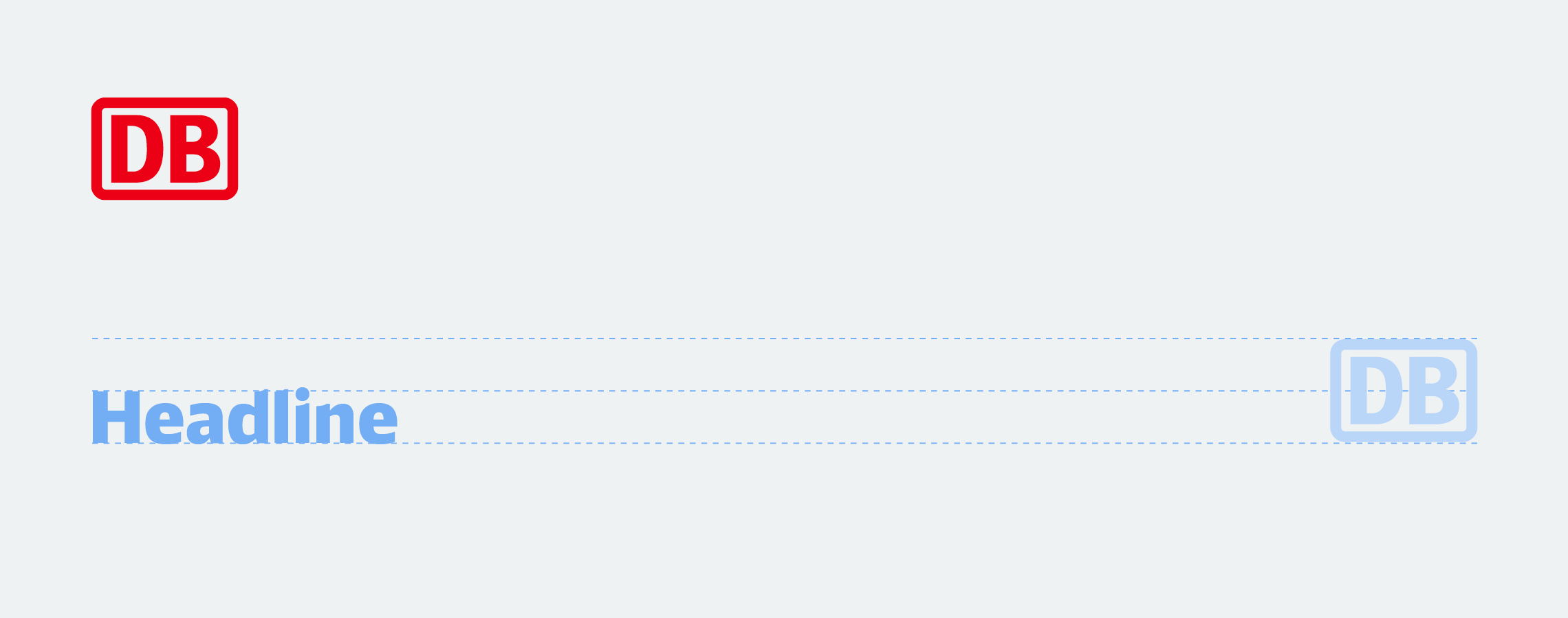
Because the logo is our most important brand element, it should be used with confidence. While it can be positioned freely inside the layout, please bear in mind that sufficient distance to the edge and other elements must be maintained. It always appears above the message. You can find further information in the Layout principle chapter.
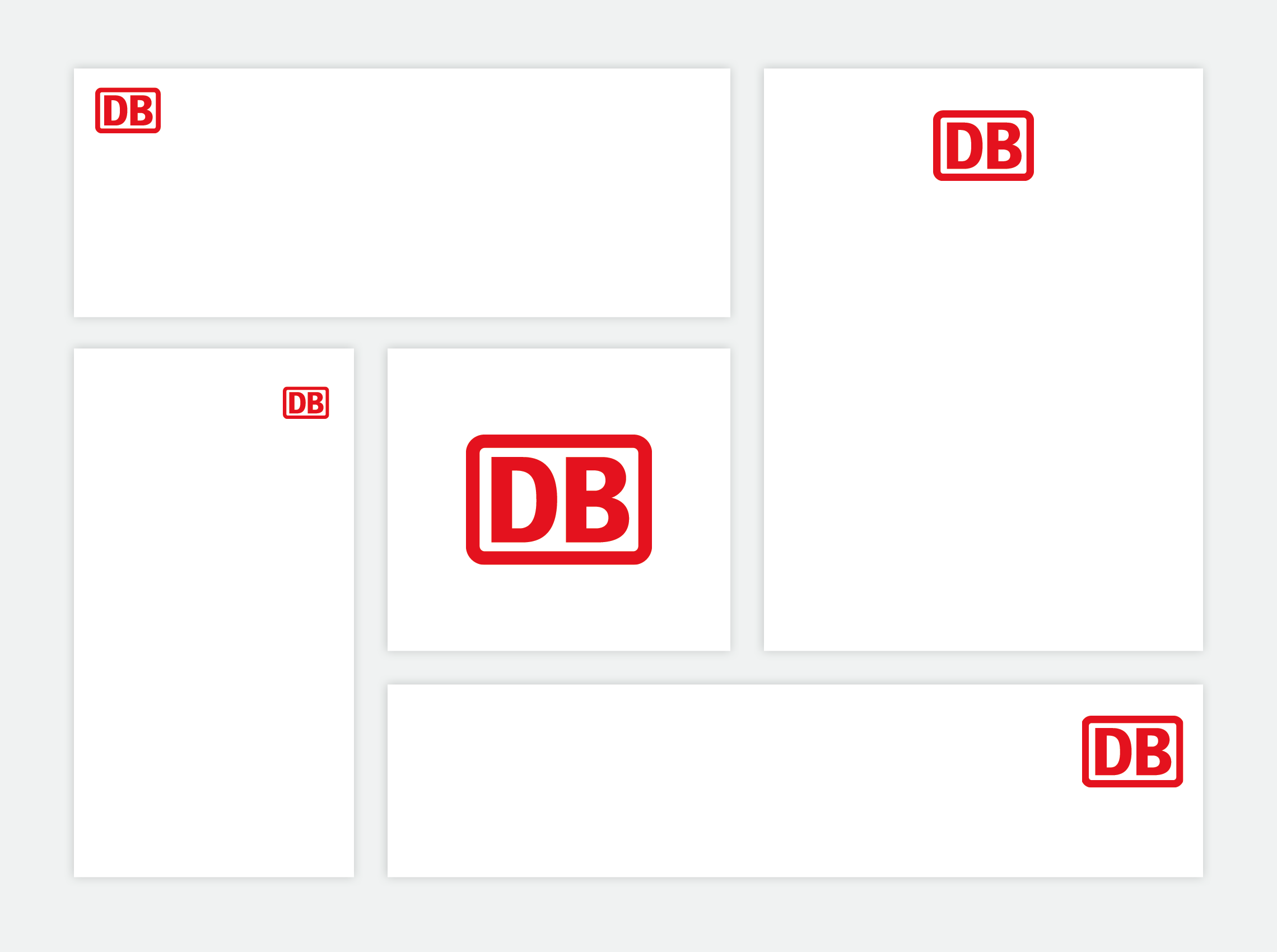
Size ratios
While the size of the logo may be chosen freely, it should complement the size of the medium and the form of communication. Please ensure that the logo is clearly recognisable, including on smaller applications or those that are viewed from afar.
The minimum and maximum ratios of logo to typography are defined. Sizes can be freely chosen between them, depending on the message and function of the communication. For easy orientation, templates with predefined logo sizes are available for most applications.
Smallest logo possible

Largest logo possible
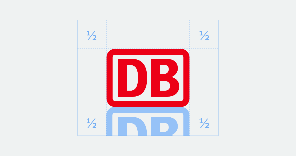
Protection zone
To ensure that the visual effect of our logo is not impaired, a minimum protective zone must be maintained on all sides. This is based on half the height of the logo. Exceptions are permitted for special applications with limited space, such as the wayfinding system or promotional items. If the figurative mark is part of logos and other markings, different spacing rules also apply.
Any questions?
Our corporate design gives you a great deal of freedom: we have consciously refrained from precisely defining every special case. Instead, you can decide for yourself which solution is the best for Deutsche Bahn. If you have any questions about how to interpret the corporate design, it goes without saying that we will be pleased to provide further assistance.
 Go
Go